
AFCO
An identity built
to take the stage.
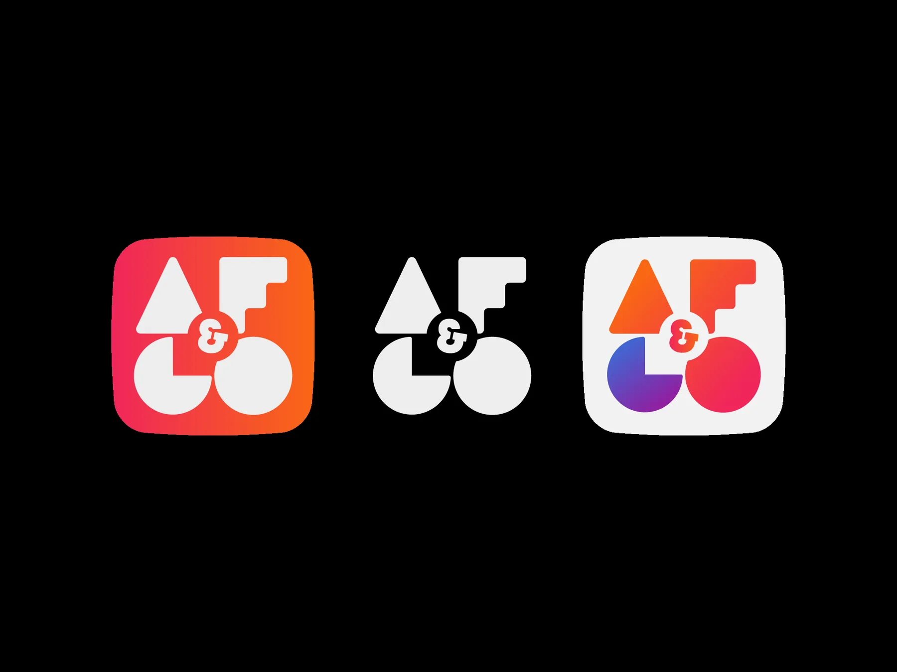
From symbol to application, the project builds a visual identity for Alberto Familiar Producciones through geometric forms, color and compositions that adapt across formats without losing recognition.
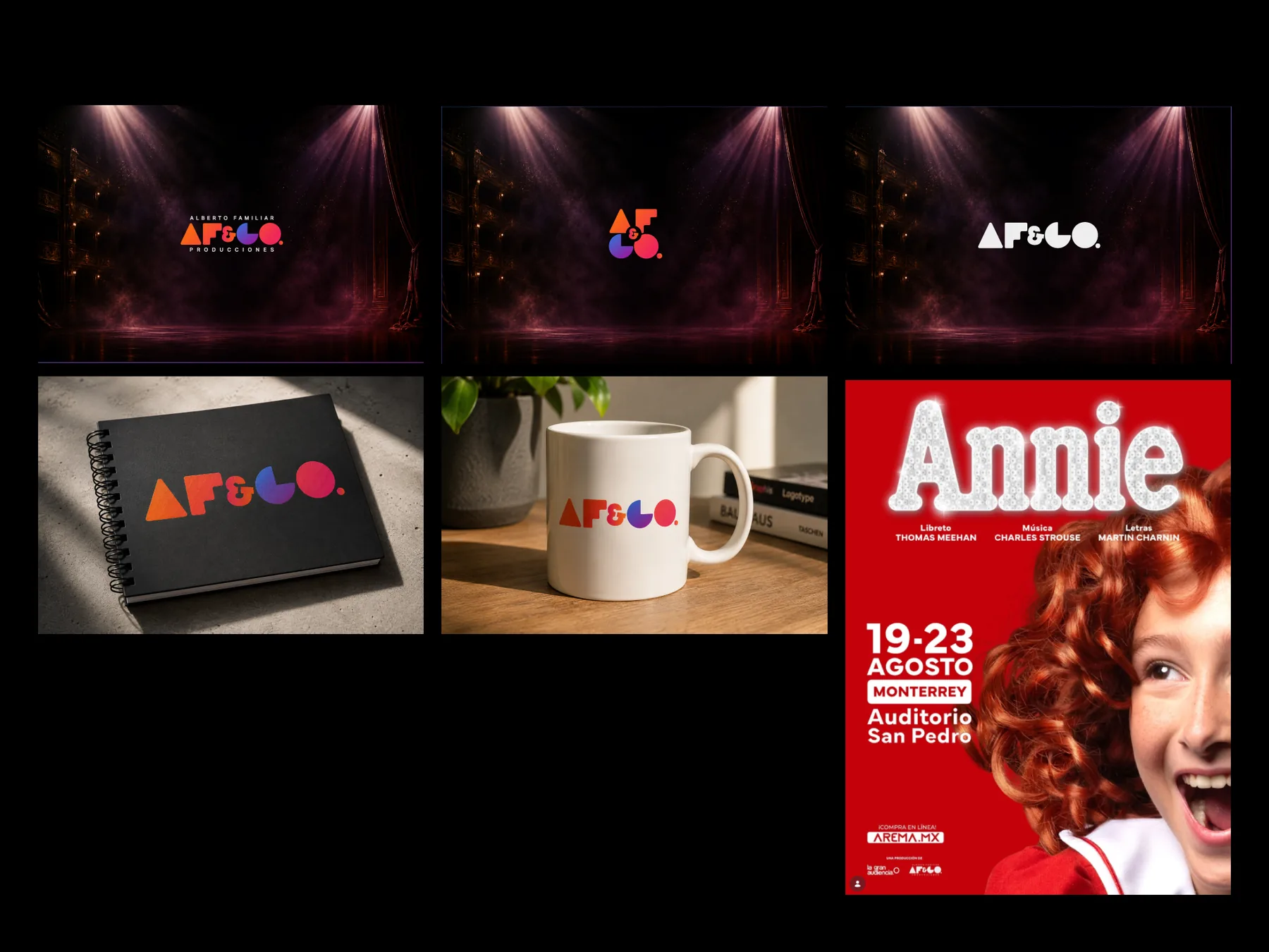

Geometric forms, contrast and color build a flexible identity that stays recognizable as formats and compositions change.
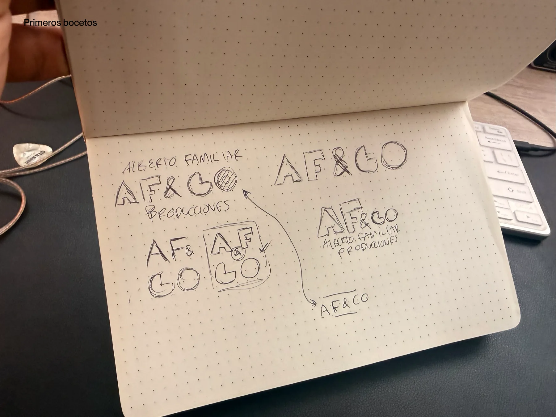
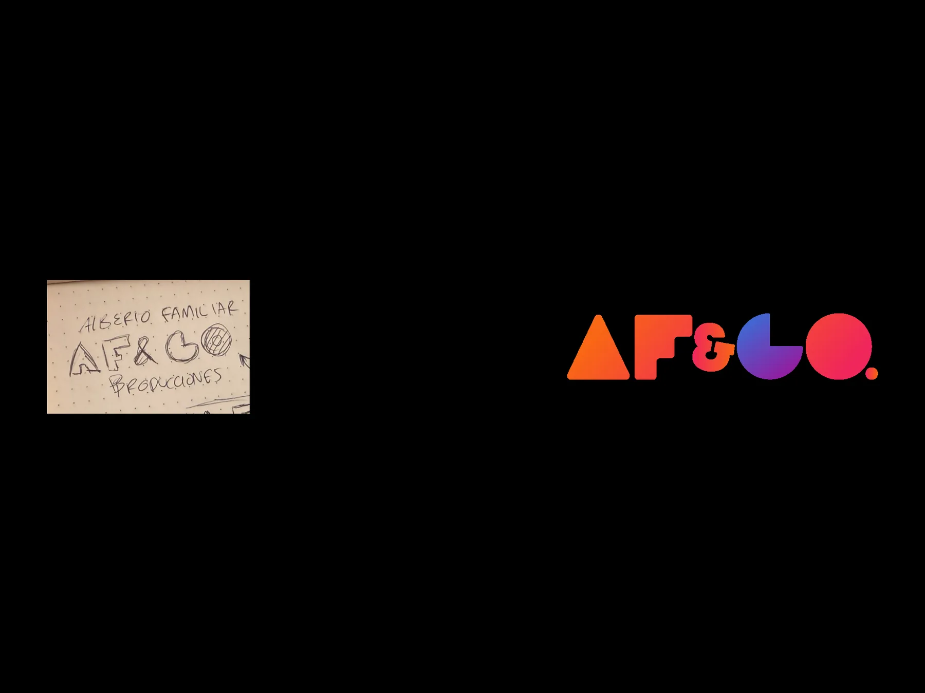
From a sketch
to a voice.
The starting point was to translate the character of a theatre production company into a contemporary, recognizable brand without relying on obvious theatrical cues.
One brand.
More than one entrance.
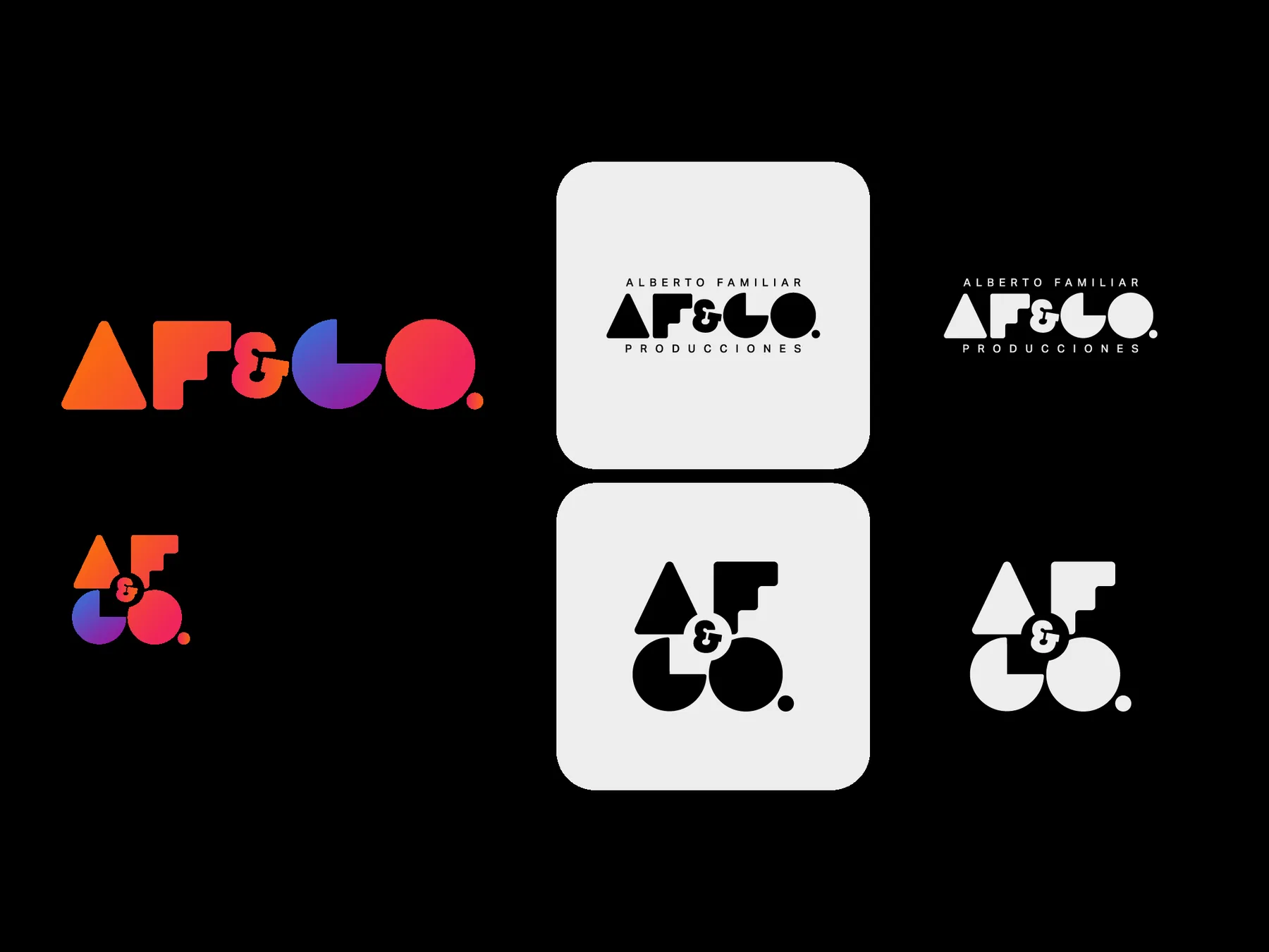
The symbol, wordmark and alternate lockups let the identity shift in scale and composition without losing its defining gesture.
Built to
show up.
The identity was designed to live across institutional communication, promotional pieces, posters and applications tied to each production.